When I do a finished pencil drawing, I typically keep the drawing as clean as possible while drawing it. This saves in clean up time during the scanning process.
I do that by starting my under-drawing with a very light (hard) pencil lead. 4H Mechanical Lead Holder. After I have established the structure, perspective and loose details of the drawing I go over the drawing tightening every thing up with a darker (softer) lead. H Lead. In the past I've used 2H, but ended up drawing harder to get a nice dark line and was pressing grooves into the page. This just makes it hard to ink. Anything darker than 2H will be likely to start smearing as you rub your hand over the drawing, resulting in a general gray "haze" over the whole drawing.
TO AVOID SMEARING AS I DRAW, I place a piece of typing paper under my hand to cover portions of the underdrawing while working on it. Sometimes for pages I will even mask off, or tape pages together, leaving a window of just the panel Im working on open to draw. Then as I move to the next panel I re-tape my "mask" pages to leave the next panel open.This light underdrawing is the equivelant to using a blue line pencil or lightboxing a sketch from another page.
After working with Randy Green he had shown me that going directly to the board with a light pencil, it saves alot of time and helps keep the energy from your sketch directly on the page.So after I have used a darker lead and finished the pencil drawing, I scan in the drawing into photoshop.I do not adjust the levels in the actual scanning program. I just set the mode to gray, and typically scan everything in at 400 DPI. I scan everything so high, because even sketches might end up in a printed sketchbook later, and you can always downsize something. You cannot improve the quality of the scan though with out rescanning. So every file I have is usually a high-res and a "interenet-ready" size that is more manageable.
So I have the scanned image open in Photoshop. I enlarge the image to 12.5% or 25% to get a clear view of the line work. I then duplicate the background layer, so that I have two layers of the line art. I change the mode of the top layer to MULTIPLY. This will automatically make your drawing darker. And not just darker but you've doubled the range of grays in your drawing.
Here is the theory behind it, when you change the contrast or levels of your drawing, you are taking away the number of grays and making the line art darker and the white of the page lighter. When you start from your original scan you only have a certain number of gray levels throughout the file. When you mulitply that file, you are doubling that number of gray levels in your drawing. Basically creating twice as much information to start from. So after the top layer is set to MULITPLY, you flatten the image, and your drawing should look alot darker and the gray "haze" will increase. Now when you adjust the gray levels you are starting from a darker image and you loose less quality when you make the page lighter to eliminate the haze.
Generally I open the Level control under Image/adjustments/levels. or Cntrl L. I move the black arrow to the right and set to around 50. and move the white arrow to the left to around 225.
These numbers are very approximate, while I slide the arrows of contrast I am looking at the image to see the change that is happening. When moving the black arrow I look for the point when the line art is getting to a nice "readable" dark and when you go too far, making the smaller details too muddy. I move the white arrow looking at the white of the page and adjusting to the point where the gray "haze" is dissappearing and when I go too far and start to lose rendering details. So the numbers I mentioned above are subject to the these conditions of each drawing.
After I set the levels I have a more clear pencil drawing, sometimes nearly black line art.

Main site at http://RuneStoneComic.com. In the DARKHAN CITY AWESOME COMICS CULTURE PODCAST, the Pantyhose Ninjas (ELDERS OF THE RUNESTONE creators Quinn Johnson & Robert Atkins, plus editor Troy Johnson) discuss comics, movies, TV and video games, all with a healthy dose of comedy. This is the place for exclusive interviews with the best professional talent in the entertainment industry, and for discussions on the best ways to break in yourself! Also on iTunes and Zune.net!
Wednesday, January 23, 2008
Friday, January 18, 2008
RuneStone Soundtracks
Since the beginning, I've always conceived Elders of the RuneStone as both a comic book series and a movie series. (As a matter of fact, I've already written the screenplay for the first film adaptation.) Along these lines, I've always imagined what songs I'd like to be on the soundtracks that would really capture the feel for the story. Thus, over the years I've created a number of "RuneStone" soundtracks, complete with CD cover designs. I thought it might be fun to share these designs with you all, and let you see the music tracks I selected.
We'll post the image files shortly, allowing you to download them for yourself should you choose to create your own mix CD with the music listed. We'd also love to hear what music you'd like to see with the series! Email us at runestonecomic@gmail.com. Enjoy!
 This is the cover for my first soundtrack idea, circa. 2002. I took a picture of a cracked sidewalk, edited out the cigarette butts, and add the blue metallic shine and shadows. Also notice the old RuneStone logo, before we add "Elders of the" to the title. The original back of the cover is not in the correct format to show here, but I've listed the tracks below:
1 - RuneStone Main Theme by Danny Elfman (at the time I used the Spider-Man main title theme)
2 - Push It by Garbage
3 - Discothecque by U2
4 - Comin' Back by The Crystal Method
5 - Go Go Dancer by Pizzicato Five
6 - You Spin Me Round (Like a Record) by Dead or Alive
7 - Firestarter by The Prodigy
8 - Hey Baby by No Doubt
9 - Temptation Waits by Garbage
10 - Blue Monday by New Order
11 - Rolling by Soul Coughing
12 - Keep Hope Alive by The Crystal Method
13 - Clint Eastwood by Gorillaz
14 - RuneStone Closing Theme by Danny Elfman (actually the Sleepy Hollow closing theme)
 Volume 2 of the RuneStone movie soundtrack, again with the old logo.
 The soundtrack for the second RuneStone movie. Yes, I've got that planned too. I've actually got the script for the first three and a half years of the comic book series already written.
 A soundtrack for random songs that would be cool in the Elders of the RuneStone franchise somewhere.
And just for the heck of it, a scary picture.
 I've affectionally titled it "OH CRAP".
We'll post the image files shortly, allowing you to download them for yourself should you choose to create your own mix CD with the music listed. We'd also love to hear what music you'd like to see with the series! Email us at runestonecomic@gmail.com. Enjoy!
Click on any image for a larger view.
 This is the cover for my first soundtrack idea, circa. 2002. I took a picture of a cracked sidewalk, edited out the cigarette butts, and add the blue metallic shine and shadows. Also notice the old RuneStone logo, before we add "Elders of the" to the title. The original back of the cover is not in the correct format to show here, but I've listed the tracks below:
1 - RuneStone Main Theme by Danny Elfman (at the time I used the Spider-Man main title theme)
2 - Push It by Garbage
3 - Discothecque by U2
4 - Comin' Back by The Crystal Method
5 - Go Go Dancer by Pizzicato Five
6 - You Spin Me Round (Like a Record) by Dead or Alive
7 - Firestarter by The Prodigy
8 - Hey Baby by No Doubt
9 - Temptation Waits by Garbage
10 - Blue Monday by New Order
11 - Rolling by Soul Coughing
12 - Keep Hope Alive by The Crystal Method
13 - Clint Eastwood by Gorillaz
14 - RuneStone Closing Theme by Danny Elfman (actually the Sleepy Hollow closing theme)
 Volume 2 of the RuneStone movie soundtrack, again with the old logo.
 The soundtrack for the second RuneStone movie. Yes, I've got that planned too. I've actually got the script for the first three and a half years of the comic book series already written.
 A soundtrack for random songs that would be cool in the Elders of the RuneStone franchise somewhere.
And just for the heck of it, a scary picture.
 I've affectionally titled it "OH CRAP".
Thursday, January 10, 2008
RuneStone, stars of ROCKBAND!
As evidenced by every cartoon of the 60's, there is one simple requirement of every hero team: to be in a rock band! (See http://youtube.com/watch?v=S-9xjGKhA2Y and http://www.homestarrunner.com/sbemail140.html if you need further evidence.) So without further ado, check out these pics of the Elders of the RuneStone crew in the game RockBand.
P.S. On a side note, I was perusing the Ninja Turtles website (www.ninjaturtles.com) and looked in their "Buy Stuff" section for back issues of their comic book. Lo and behold that Tales of the TMNT #31 (which I wrote) is one of the handful that is sold out! That's got to count for something in these parts! Just thought I'd share. :)
 One variation of the band, with Zeniff (Adder), Kat (Catalyst), and Dain (Gremlin).
 A second varation of the team with Kat (Catalyst), Scott (Gar), and Jenny (HardTap).
 More group shots.


 Scott (Gar) in the lead singer position (note the power stance).
 Scott letting it out.
 Jenny (HardTap) on the drums.
 Jenny ready to go.
 Dain (Gremlin) up at bat.
 Don't get in his way or he'll drum you to Kingdom Come!
 Classic photo pose.
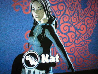
 Kat (Catalyst) as lead singer.
 Kat sings.
 Raising the roof!
 Kat outfit variation.
 Bringing down the house!
 Zeniff (Adder) as lead guitar (every ninja's dream).
 Zeniff wailing on the guitar.
 Kat and Zeniff share a moment.
P.S. On a side note, I was perusing the Ninja Turtles website (www.ninjaturtles.com) and looked in their "Buy Stuff" section for back issues of their comic book. Lo and behold that Tales of the TMNT #31 (which I wrote) is one of the handful that is sold out! That's got to count for something in these parts! Just thought I'd share. :)
 One variation of the band, with Zeniff (Adder), Kat (Catalyst), and Dain (Gremlin).
 A second varation of the team with Kat (Catalyst), Scott (Gar), and Jenny (HardTap).
 More group shots.


 Scott (Gar) in the lead singer position (note the power stance).
 Scott letting it out.
 Jenny (HardTap) on the drums.
 Jenny ready to go.
 Dain (Gremlin) up at bat.
 Don't get in his way or he'll drum you to Kingdom Come!
 Classic photo pose.
 Kat (Catalyst) as lead singer.
 Kat sings.
 Raising the roof!
 Kat outfit variation.
 Bringing down the house!
 Zeniff (Adder) as lead guitar (every ninja's dream).
 Zeniff wailing on the guitar.
 Kat and Zeniff share a moment.
Friday, January 4, 2008
Before there was RuneStone there was...SLYTHE Part 2
Here is more art of SLYTHE, a character I created in my junior high days before Elders of the RuneStone. The artwork is not quite as good as Robert's, but I sense his anxiety anyway. Enjoy! (Click on any image for a larger version) An unfinished cover. Still one of my favorites.
An unfinished cover. Still one of my favorites. Page 1 of my original attempt at the comic, in all its ballpoint pen-inked, crayon-colored glory! Taking place in the distant future (at the time) of 1995! I originally taped a bunch of sketchbook pages together to make the "book."
 Page 2. In hindsight: They didn't have enough money for food? On a farm? But they had enough money to move to New York? And don't you love little Slythe's cute cartoon eyes? :)
 Page 3. Pay no attention to the "4" at the bottom of the page. I'm trying to remember why I was so insistent on Slythe only knowing karate and kickboxing; I think it's from the influence of Van Damme movies. Darn those "troublesome punks"!
 Page 4. Still a pretty cool fight scene in my opinion. Love those punks' hair! When you have Slythe reflections in your eyes, kiss your butt good-bye.
 Page 5. Some time must have passed before doing this page; notice the abrupt change in art style. This is when I was discovering the Ninja Turtles comics by Kevin Eastman and Peter Laird and tried to emulate the toning / inking style. Can you say overkill?
 Page 6. The introduction of Mavery, who would go on to be Slythe's wife. Originally I gave the female Reptillians lizard faces too, but made the (weird) decision to give them human-like faces instead. I mean, lizard-faces just can't be hot.
 Page 7. Another sweet fight scene.
 Page 8. You can tell where I messed with Mavery's face a lot. You can also tell where I ran out of steam. Regarding the last panel, don't be alarmed, they were just going to be having lunch.
 A homemade advertisement for my own "Masters Comics", featuring Mutant, a character from another series I had ideas for. They were the "Ultimate Force of Fun"!
 The cover for my 2nd attempt at the Slythe comic, a major revamping of the original version. Love that over-inking with the ballpoint pen! I liked the palm-strike effect though.
 Page 1. The kidnapper at the bottom would be the Dark Hood's main henchman. Don't worry, Slythe would save all the kidnapped children.
 Page 2. Good thing there were "military soldiers" there, as opposed to the regular kind.
 Page 3. Notice where I ran out of steam again (hint: there's only half a page).
 A drawing of Slythe as a hero in a video game I had in mind called "Fear City." It was one of my first of him, and the only time I had him breathe fire.
 The Dark Hood, formerly the Reaper. This fellow was the template for the Monolith in RuneStone.
 In the Slythe comic, it would be revealed that the Dark Hood was not human! The effect was lessened when a kid in my class asked why he was wearing a diaper.
 A later drawing of the big, beefy Dark Hood (diaper still intact).
 Slythe's sensei Wu Shu, who later became Adder's sensei Koji Nakashi in Elders of the RuneStone.
 A dream match inspired by the days of the Batman Vs. Predator comic: Slythe Vs. Predator!!
 An idea I had for a team of superhero Reptillians led by Slythe in his alternate future. The lone female, Eynstine, was Slythe's wife Mavery.
 Inspired by the Marvel Comics Infinity War where everybody fought their evil clone: Slythe Vs. Un-Slythe!
 And how that fight would have ended, when Slythe unleashes the mystic powers granted him by the spirit of his sensei Wu Shu. It's payback time. FOOM!!
 For great justice. I realize now that back then I liked conceptualizing more than hunkering down to make an actual comic.
 Slythe montage. Complete with Final Fight street fighting moves!
 As the story got more complex and I envisioned a "Sega CD" video game, I had ideas for a team of operatives as Slythe's back-up.
 Concepts for Slythe's "spirit powers" for the video game.
 One of my first attempts at using a crowquill pen. And a rare shot of Slythe in kung fu pants. That cloaked fellow is another vague character idea.
 And last but not least, a shot of Slythe plus two other characters I never did anything with.
Subscribe to:
Posts (Atom)